Featured
Animated
Hover over a thumbnail to preview the live animation.
Professional
Elegant
Dashboards
Futuristic
Playful
Artistic
Pick a vibe.
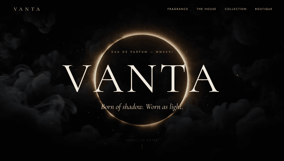
A scroll-driven, Awwwards-style landing page where a hero video scrubs frame-by-frame as you scroll — buttery inertia, animated type, and a pinned horizontal section that make the whole page feel like a film.
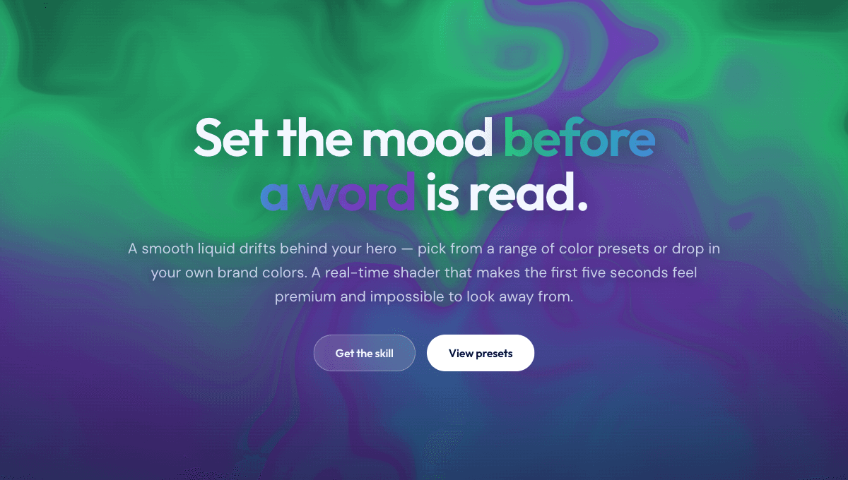
A flowing, liquid animated background that makes a landing page feel alive and expensive — premium motion without touching WebGL code.
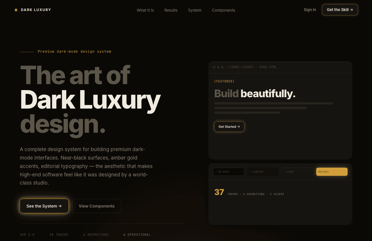
Deep warm darks, confident typography, one electric accent — the visual language of apps that cost money and look like it.
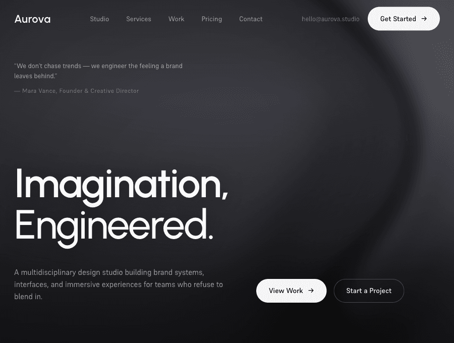
A complete premium dark agency landing page — near-black canvas, grayscale imagery, and a slow animated aurora as the only color, across a full set of scroll-animated sections from hero to giant footer wordmark.
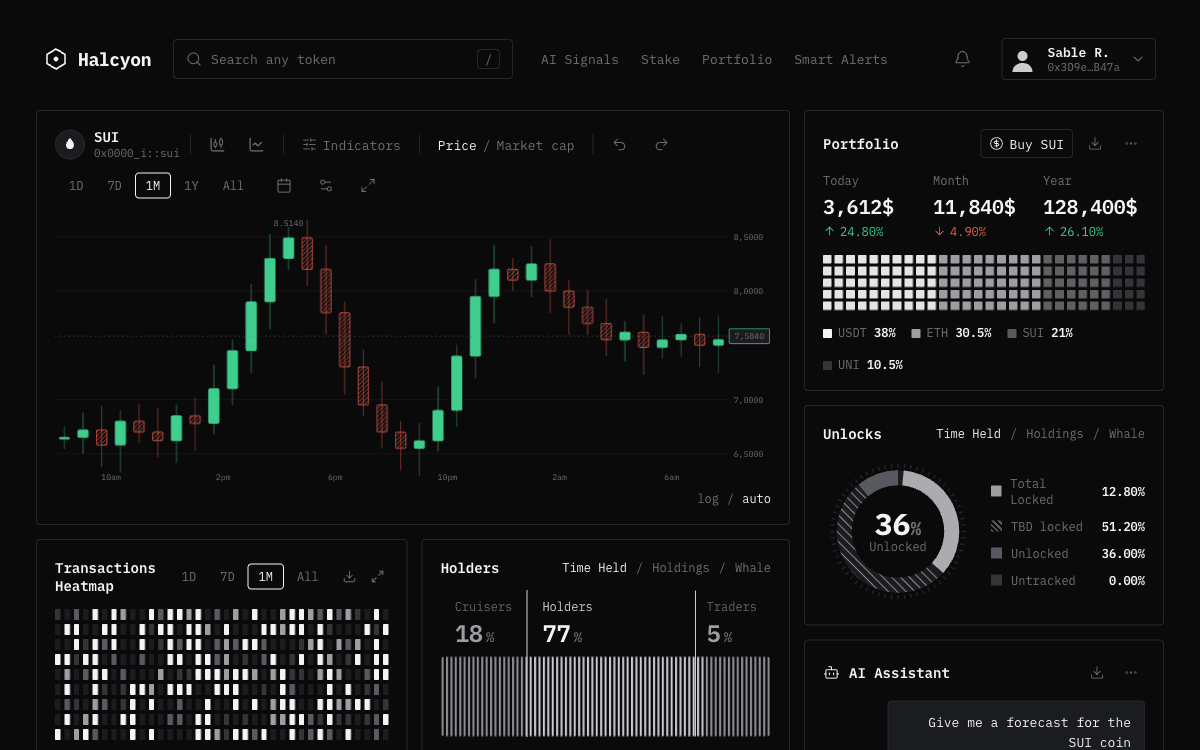
The terminal-mono aesthetic for crypto and trading interfaces — monospace type, near-monochrome dark canvas, one disciplined accent color, and hand-built data textures. Refined Bloomberg terminal, not glowing casino.
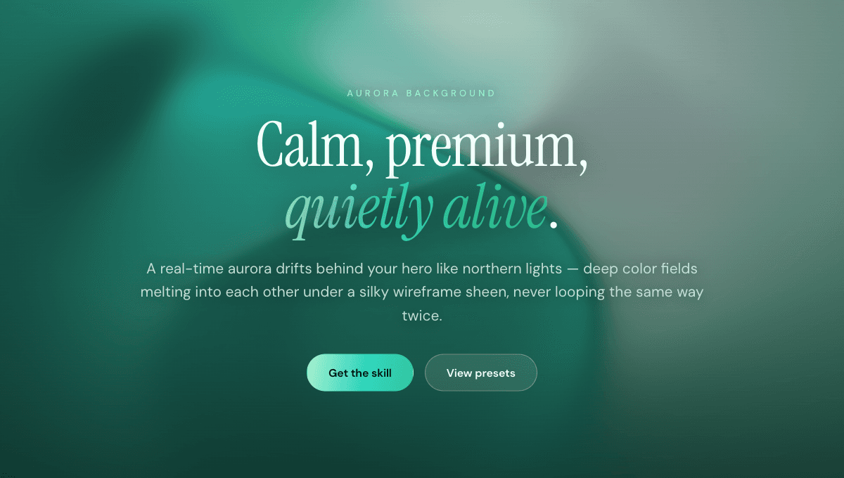
A soft, flowing animated mesh gradient that drifts across the screen like northern lights — calm, premium, and quietly alive behind your hero.
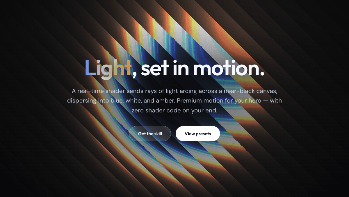
A glowing animated shader background of light rays arcing across a near-black screen — a premium, high-end hero backdrop with zero shader code on your end.
A flowing, liquid animated background that makes a landing page feel alive and expensive — premium motion without touching WebGL code.
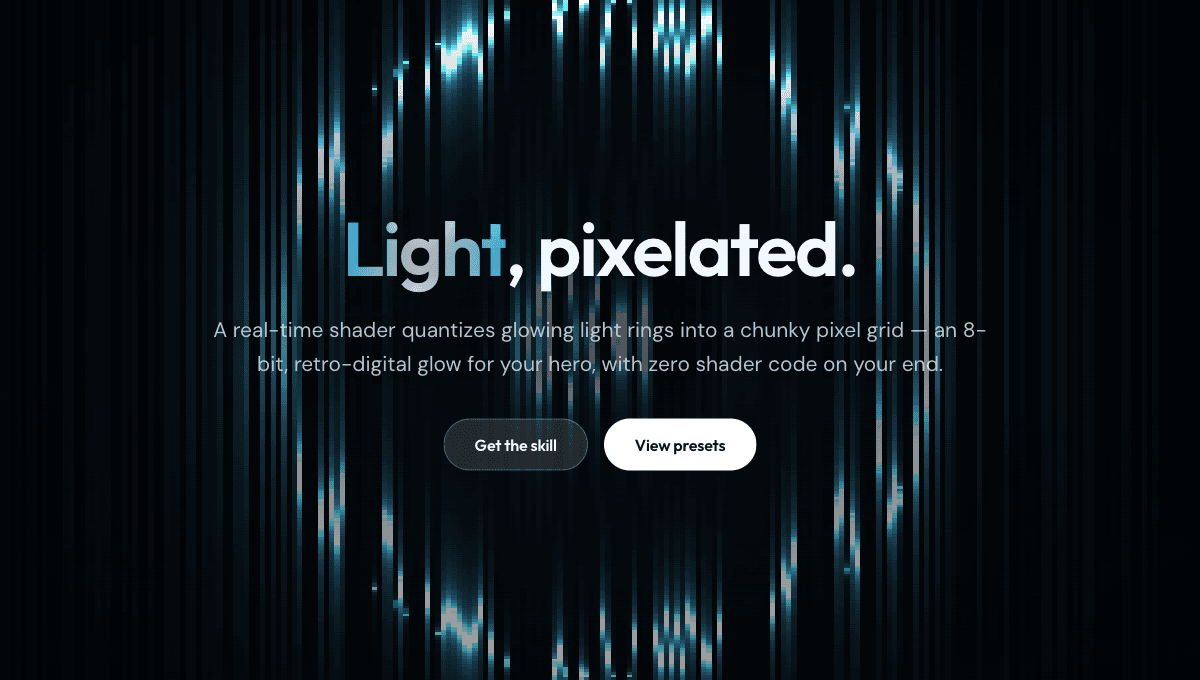
A glowing animated background of chunky pixelated light rings radiating from a near-black center — an 8-bit, retro-digital hero backdrop with zero shader code on your end.
A soft, flowing animated mesh gradient that drifts across the screen like northern lights — calm, premium, and quietly alive behind your hero.
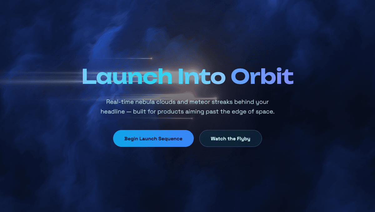
Deep-space nebula clouds with glowing meteor streaks and faint stars, rendered live by a real-time shader — a cinematic backdrop that makes any dark hero feel like a launch trailer.
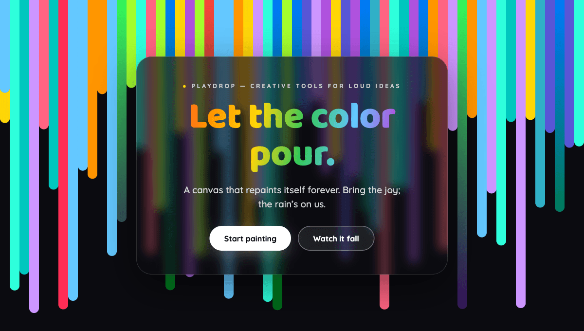
A playful rain of colorful streaks dripping down the screen like digital paint — piling up into a rainbow curtain that repaints itself forever. Pure energy and joy.
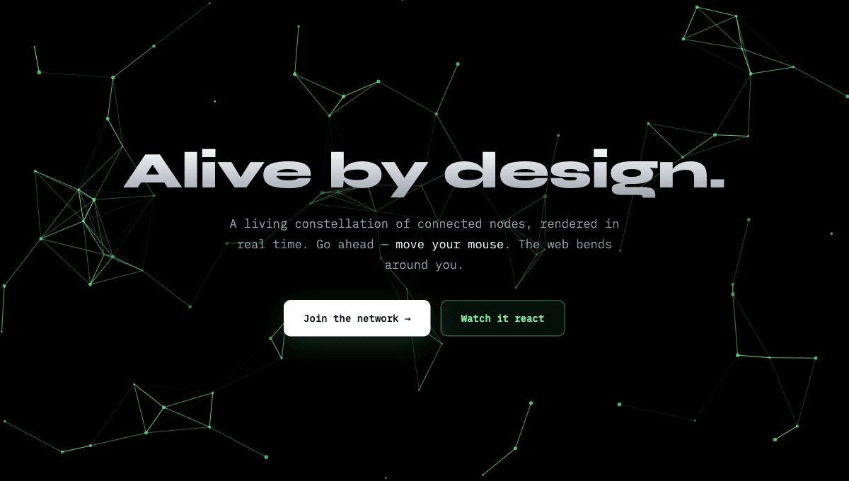
A living web of glowing dots drifting across a black screen, connected by thin fading lines — and it reacts to your cursor, scattering and brightening as you move. A background that feels like it's paying attention.
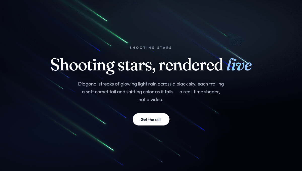
Diagonal streaks of glowing light with soft comet tails raining across a black sky, color-shifting as they fall under a faint cinematic camera shake — a dreamy, magical meteor shower rendered live by a shader.
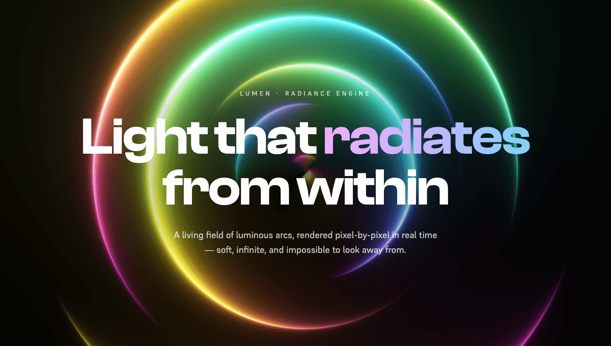
Luminous concentric rings of light blooming and spiraling outward from a single center point, color-cycling through the full iridescent spectrum on pure black — a striking, otherworldly hero rendered live by a raw WebGL2 shader.
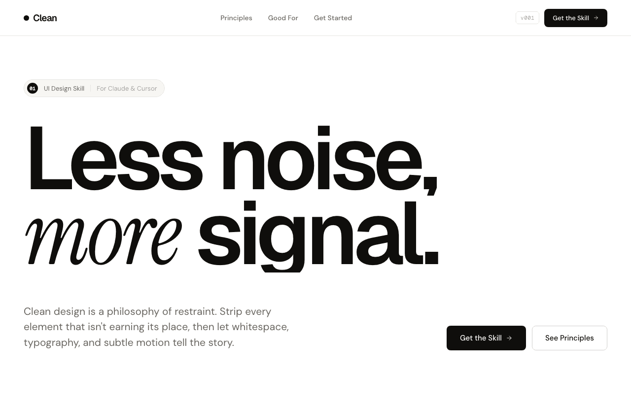
The style that makes apps look like a funded startup shipped them — no decoration, just everything in the right place.
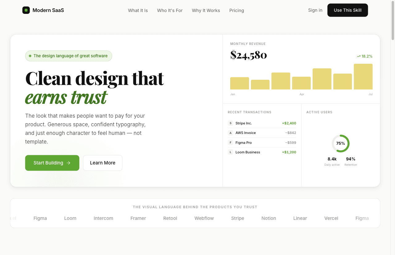
Clean, confident, and instantly trustworthy. The visual language behind Linear, Vercel, and Notion — for products that need to look funded without being funded.
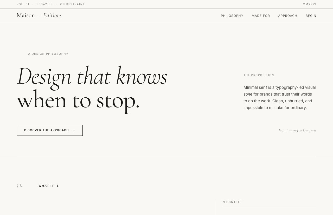
Large confident serifs, generous whitespace, restrained palette — looks like a designer was involved even when one wasn't.
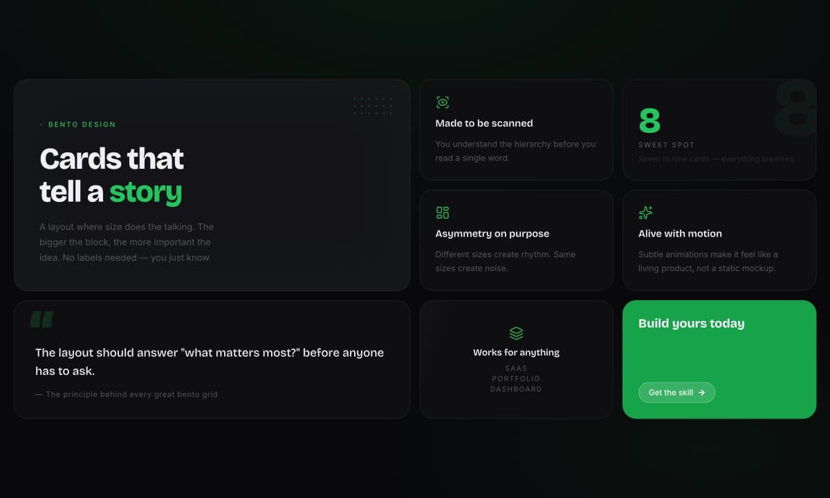
Asymmetric cards that vary in size and weight — the layout behind Apple's product pages and viral feature sections.
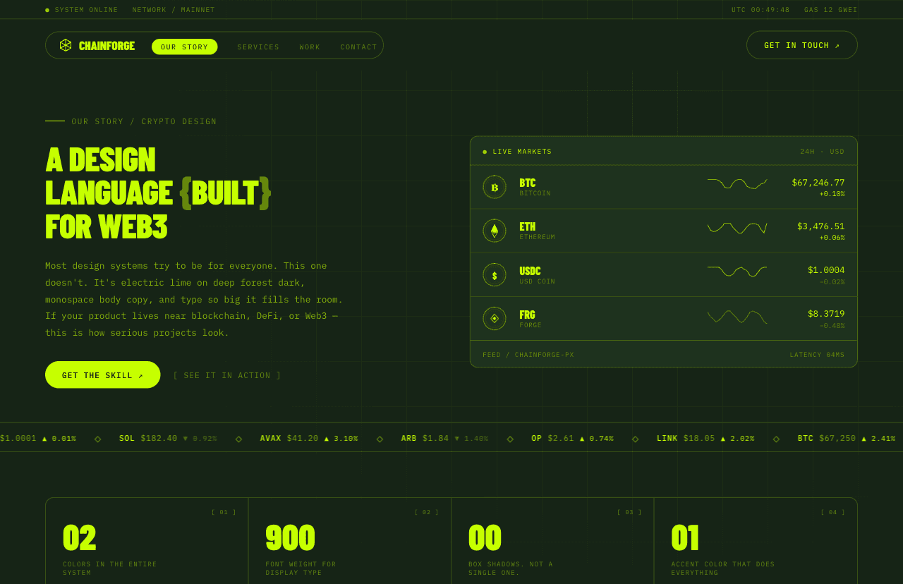
Electric editorial design for crypto and Web3 — electric lime on deep dark, bracket-style CTAs, display-scale type, and code-syntax aesthetics that signal technical credibility before a line of product is shipped.
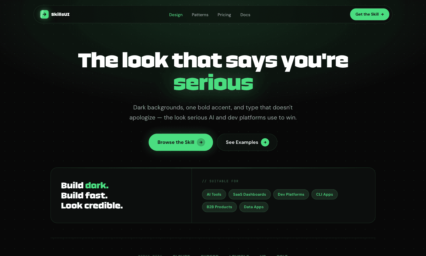
Dark, precise, and charged with intelligence. The design language of AI-native products — Perplexity, Cursor, Runway.
A complete premium dark agency landing page — near-black canvas, grayscale imagery, and a slow animated aurora as the only color, across a full set of scroll-animated sections from hero to giant footer wordmark.
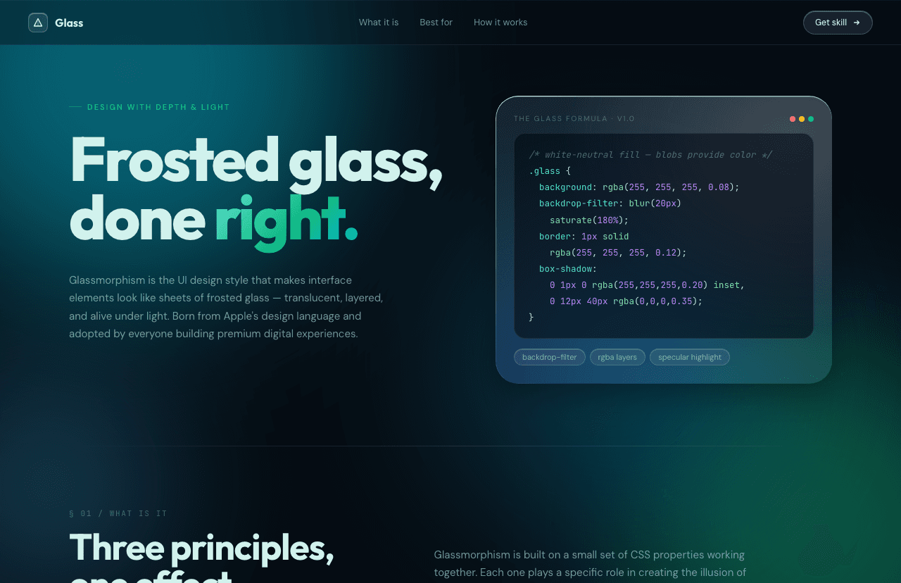
The frosted glass effect from iPhone notifications and Apple Vision Pro — layered, transparent, and immediately premium.
Deep warm darks, confident typography, one electric accent — the visual language of apps that cost money and look like it.
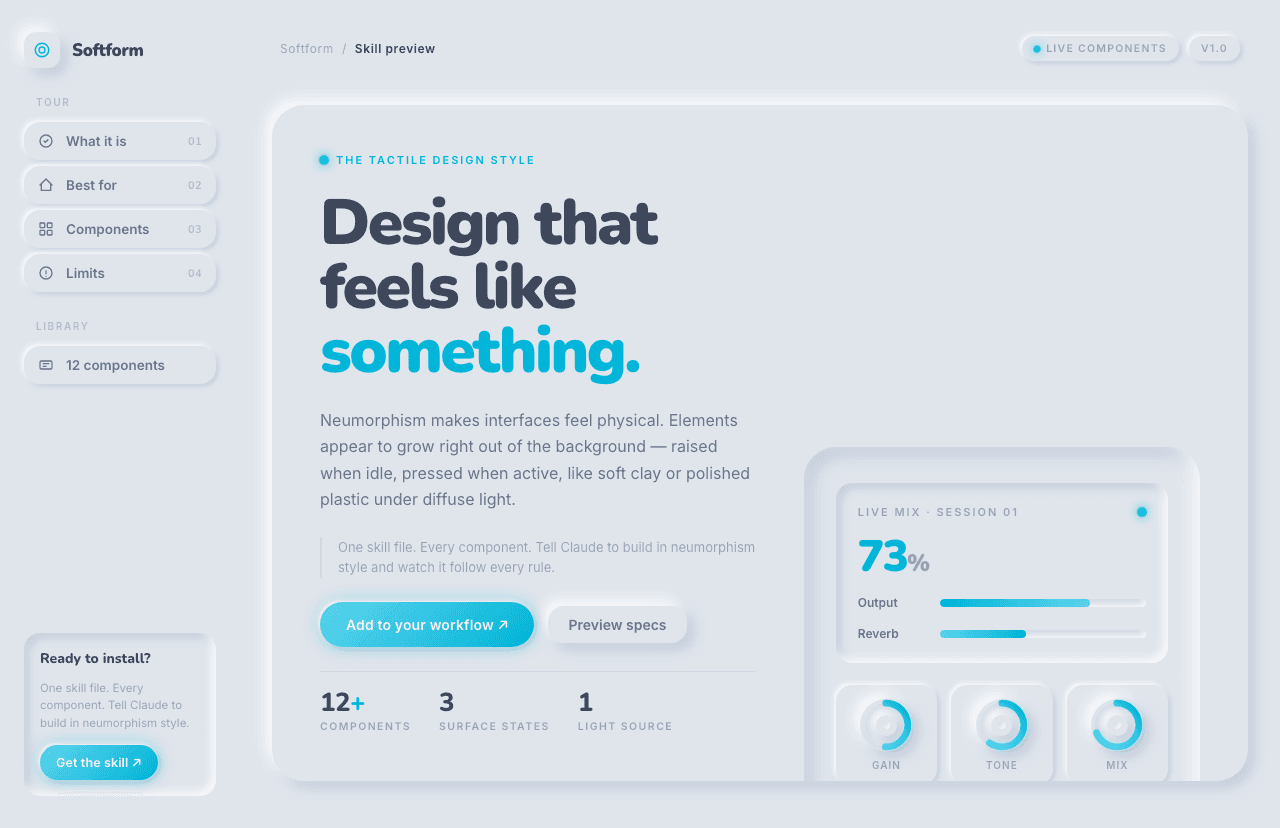
Buttons that push in, sliders that look like dials — a tactile, physical quality unlike anything else in digital UI.
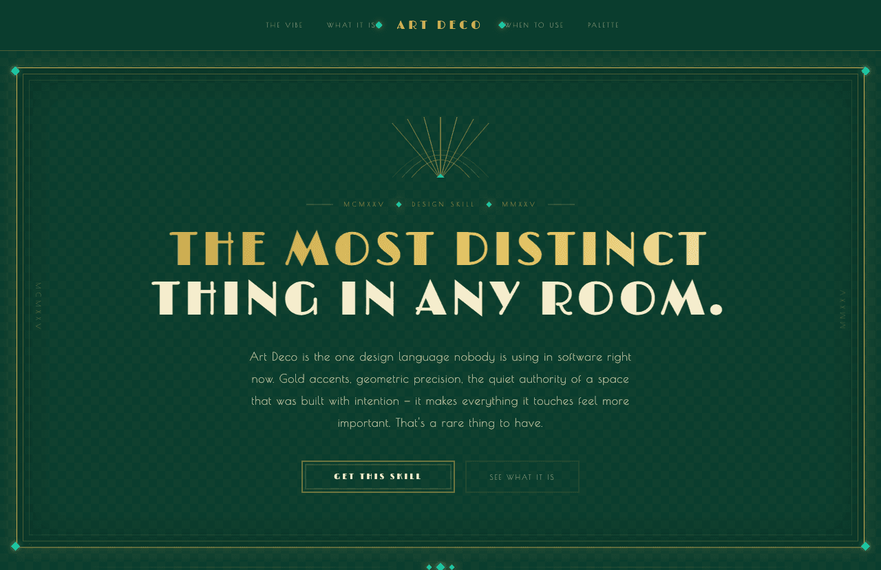
The design language of the 1920s — gold accents, geometric symmetry, bold vertical lines, and a sense of occasion that makes everything it touches feel more important.
A scroll-driven, Awwwards-style landing page where a hero video scrubs frame-by-frame as you scroll — buttery inertia, animated type, and a pinned horizontal section that make the whole page feel like a film.
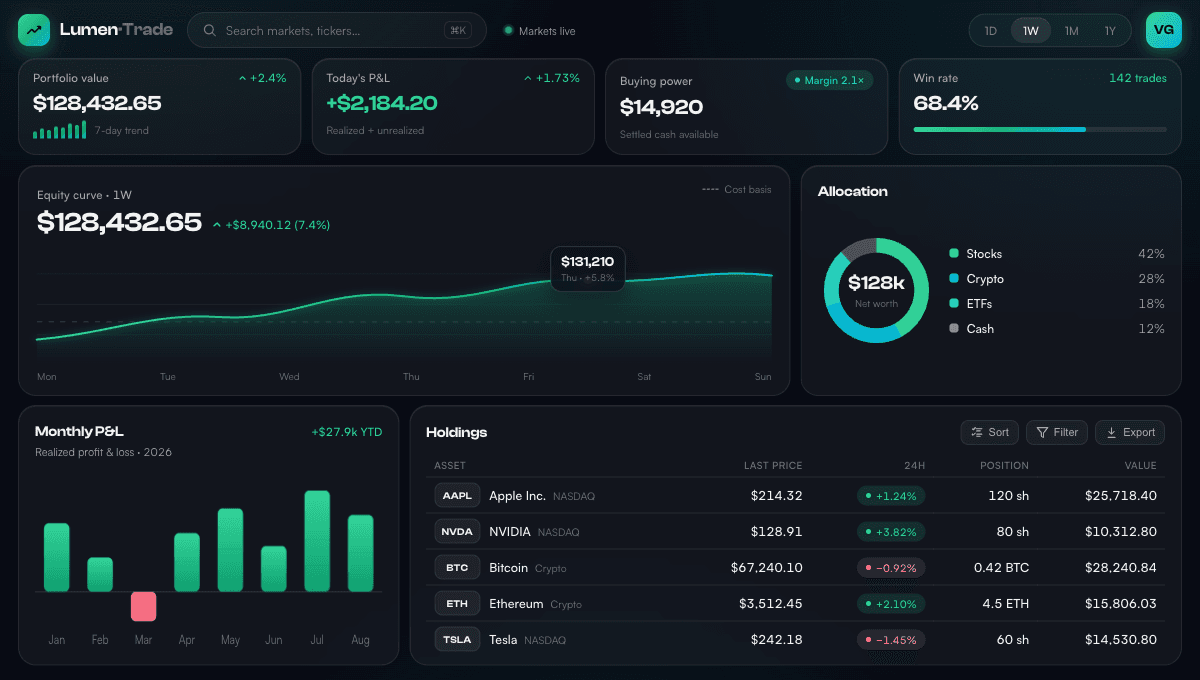
Numbers as first-class citizens. The visual language of Stripe, Wise, and Mercury — where design precision and financial confidence are indistinguishable.
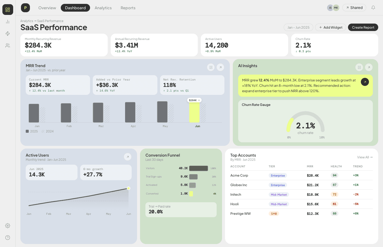
A purpose-built design style for analytics and performance tracking interfaces — a spacious, editorial light layout with soft tinted panels, a single lime accent, and crisp mono numerals. Data-dense, but never overwhelming.
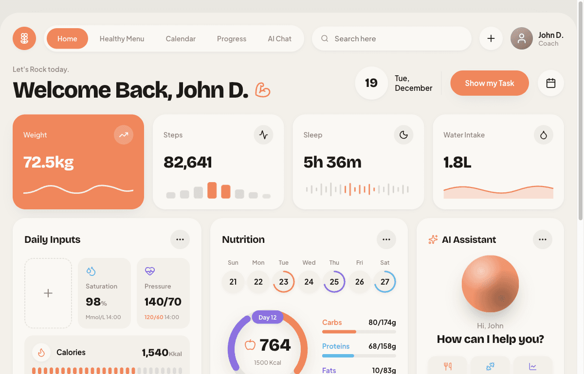
Health data that feels warm, not clinical. A framed canvas, one bold hero metric, and a different little chart on every card — the polished look of a real consumer fitness product, not another gray dashboard.
The terminal-mono aesthetic for crypto and trading interfaces — monospace type, near-monochrome dark canvas, one disciplined accent color, and hand-built data textures. Refined Bloomberg terminal, not glowing casino.
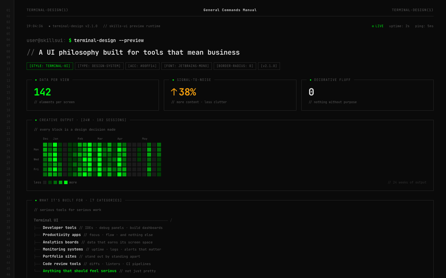
The prompt, the cursor, the monospace grid. Terminal design takes the CLI's honest visual vocabulary and turns it into a complete design system.
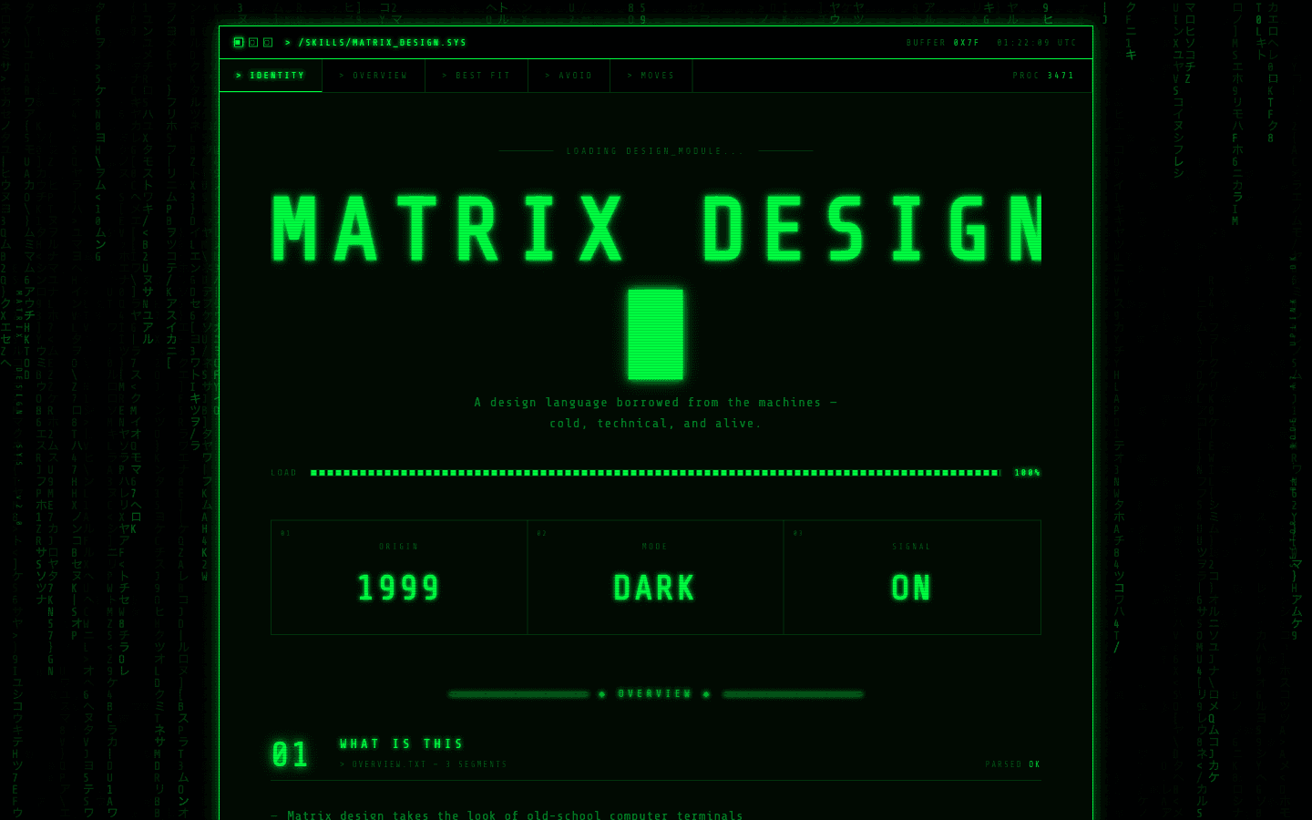
Green on black. One font. One grid. The design language of the digital void — code rain, terminal readouts, and interfaces that feel like they're running the world.
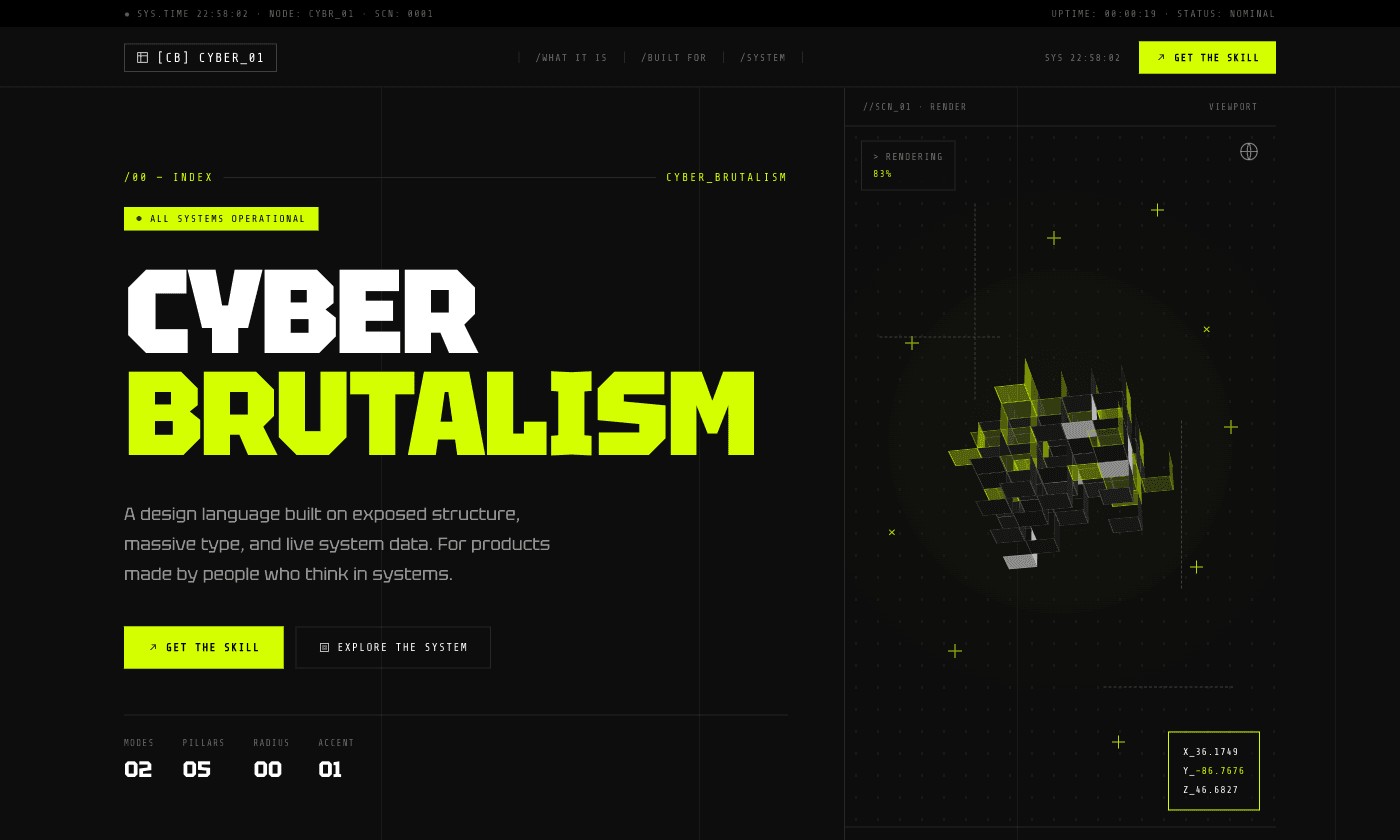
Raw brutalist structure meets technical systems aesthetic. Massive condensed headlines, exposed grid lines, coordinate readouts as decoration, and electric accents — for products where 'function over form' is a real value.
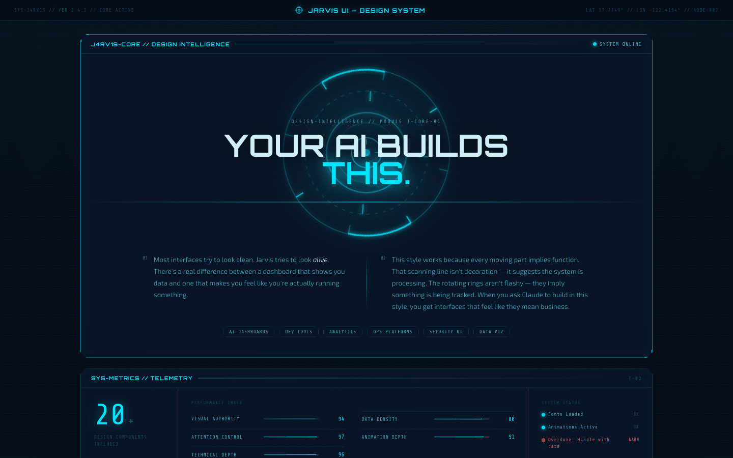
Tony Stark's AI made real — translucent panels floating in dark space, arc reactor blue appearing only where it matters, calm authority at every interaction.
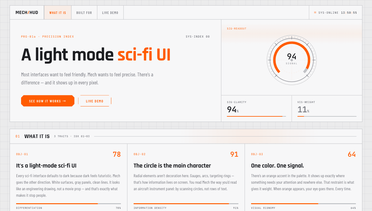
A light-background sci-fi HUD aesthetic built on clinical precision — thin line work, targeting reticles, dot-matrix numerals, and a single warning-light accent color.
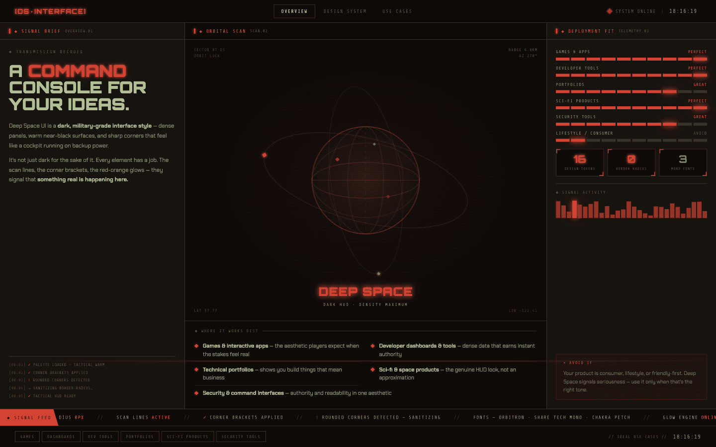
The visual language of spacecraft panels and mission control — dark, precise, meditative. For tools where users need to feel like they're operating something significant.
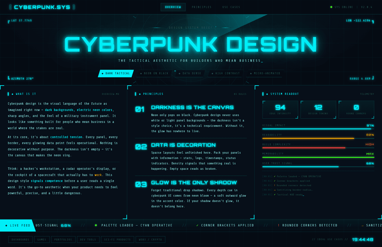
Neon light, dark interfaces, and information overload as atmosphere. The aesthetic of Blade Runner terminals and Cyberpunk 2077 for gaming and creative tools.
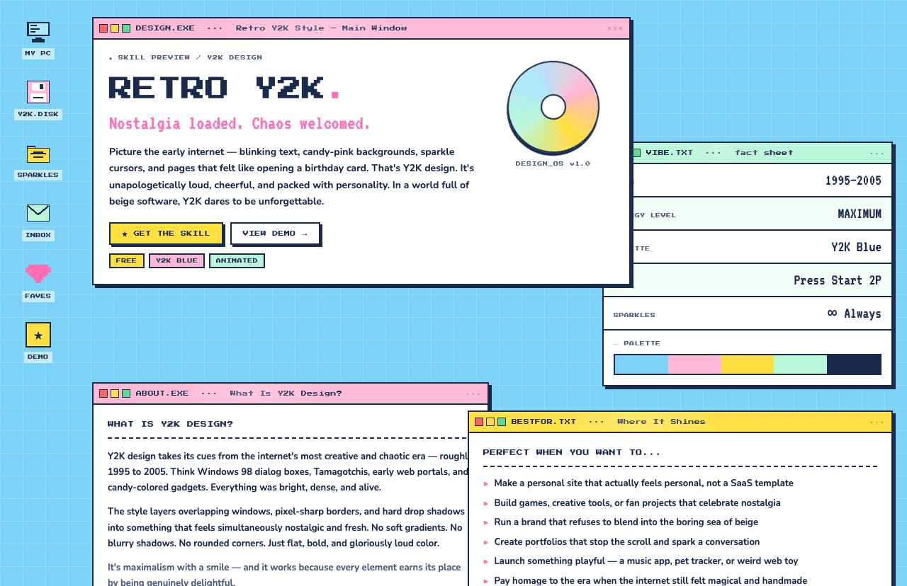
Early-2000s internet energy — chunky, colorful, unapologetically fun. The style that gets noticed, shared, and remembered.
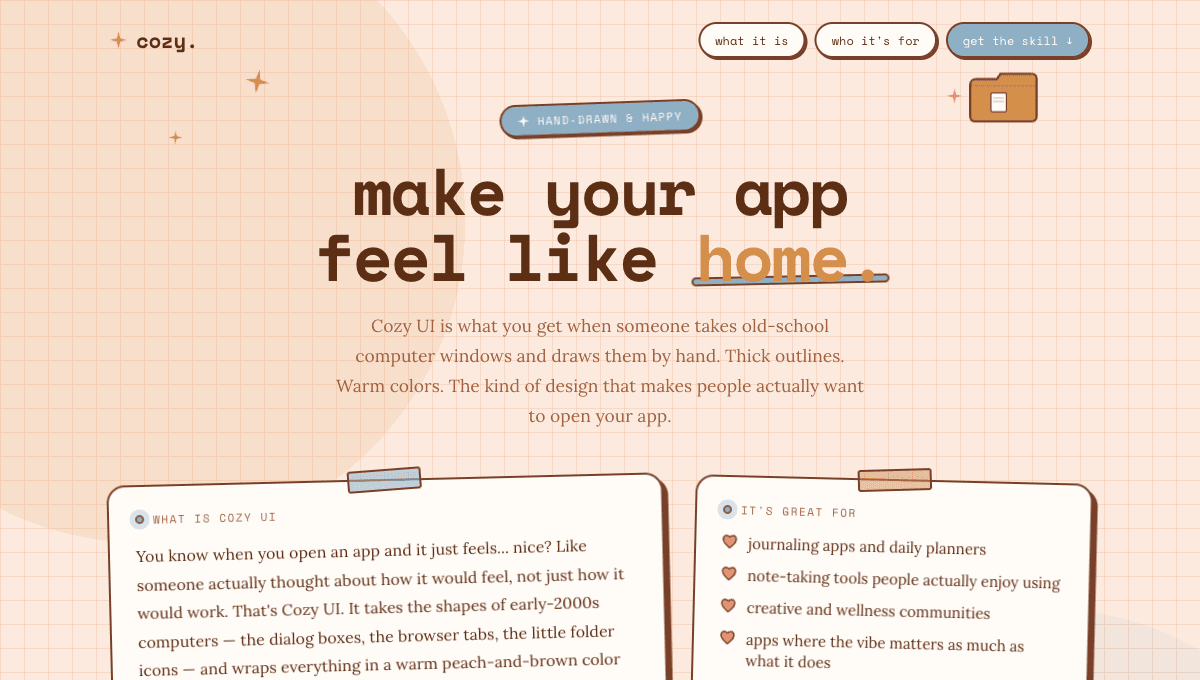
Early 2000s computer nostalgia meets cottagecore warmth. Hand-illustrated OS elements, thick warm outlines, and a soft peach palette — for apps that feel as good as they look.
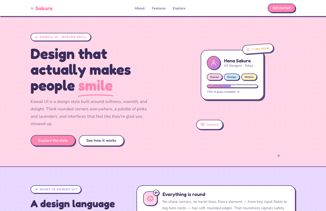
Japanese cuteness as a design philosophy — pastel palettes, extreme rounding, and micro-personality moments that create genuine emotional attachment between users and apps.
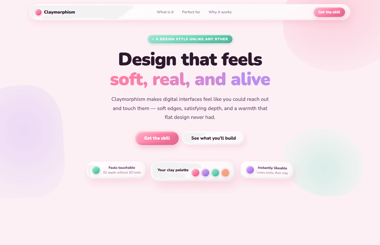
Soft, inflated UI that looks sculpted from clay. The design language of Duolingo, Headspace, and consumer apps that make you smile.
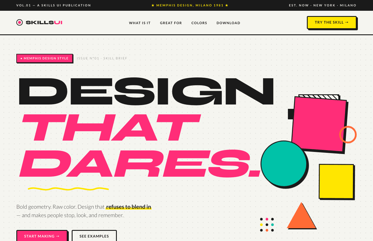
Squiggly lines, clashing colors, and geometric shapes on everything. The bold 80s design revival that turns visual energy into personality.
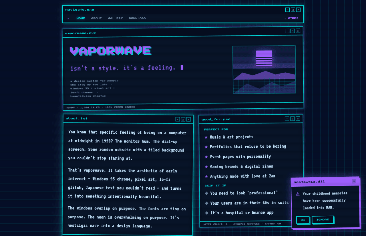
Hot pinks and electric purples bleeding into dark backgrounds, Roman busts in digital space, the dreamy aesthetic of a memory that never actually happened.
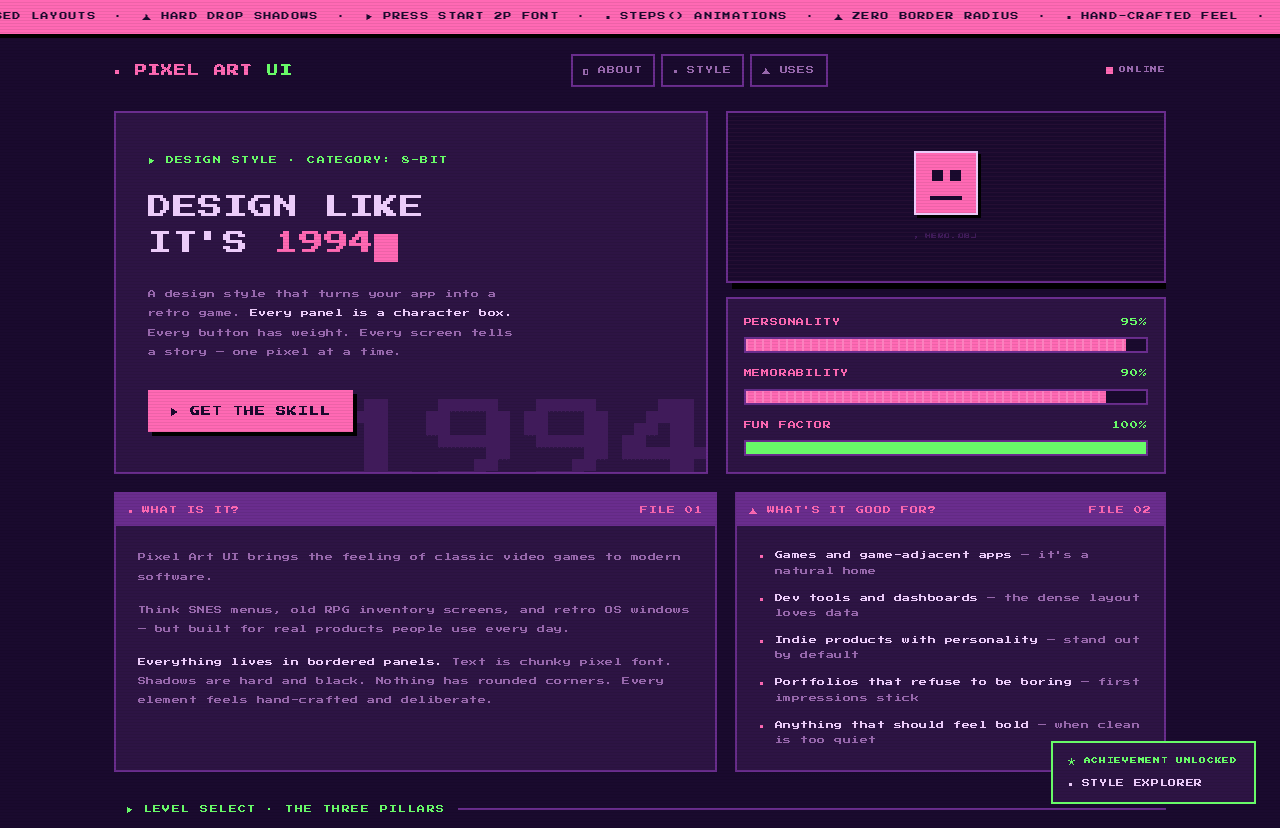
Every pixel a decision. The handmade aesthetic of SNES-era RPGs and indie games, applied to web UI for products that want to say 'made with love.'
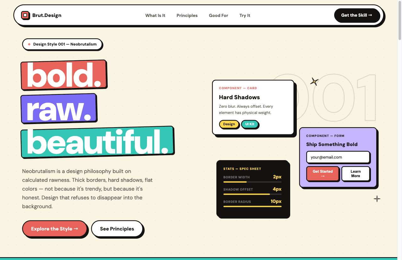
Heavy borders, bold offset shadows, flat colors — raw and intentional. The style behind Gumroad and the best indie launches.
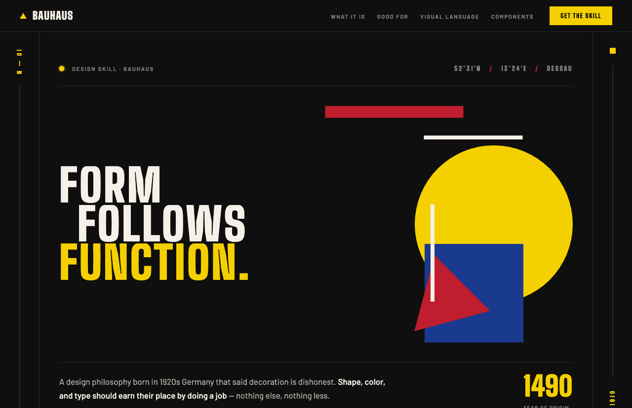
Primary colors, geometric shapes, and a grid so rigorously followed it becomes beautiful. Timeless design conviction for products that make a statement.
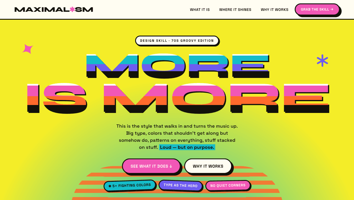
Loud, dense, and unapologetically designed — oversized treated type, clashing saturated colors, decorative patterns, and overlapping stickers and motifs that grab attention the second the page loads.